Ten years ago, web designers first started discussing “responsive design,” aka ensuring that websites created with desktops in mind would load legibly on smartphones and tablets. The rapid rise of mobile browsing has created critical usability issues for traditional websites. Designers and developers began experimenting with various ways to make designs that would adapt to all devices as a one-website-fits-all solution. This laid the groundwork for what would become known as “responsive design.”
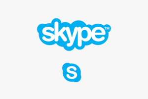
The main idea here is to make sure the brand is readable and legible at smaller sizes on all devices or print mediums. Digitally, a logo should look recognizable on a desktop, tablet, or phone. This same scaling is similar to the issue that has existed in print, where a logo must fit on billboards, letterheads and business cards. In a world where screens come in all sizes and shapes, we need logos that can make an elegant and efficient use of any screen space. They use more or fewer elements, and those elements can be organized in various ways to match the environment.
Below, check out how some household brand names have transitioned their logo overtime to become less complex, involving fewer design elements and playing up the iconic ones that are most recognizable no matter what the scale. Even the simplest original logo below, Chanel, can be made simple.


